Which Font is Best for Signage?
Tips for Choosing the Right Font
With over 500,000 different designs to choose from, which font do you use when it comes to creating your signage? Do you go for something classic, such as Times New Roman, or do you opt for something quirky, like Bauhaus 93?
In this short article, we look at fonts for your signage, including how to use them and how not to use them. We’ll also give you a rundown of some of the best fonts to use across your signage, posters and other print.
Contents
- Upper or Lower case?
- Sans or Sans Serif?
- The Top 5 Best Fonts for Signage

1. Upper or Lower case?
The choice between upper and lower case is never the easiest decision when designing your signage, whether it’s for interior signage or exterior signage.
Which font do you choose?
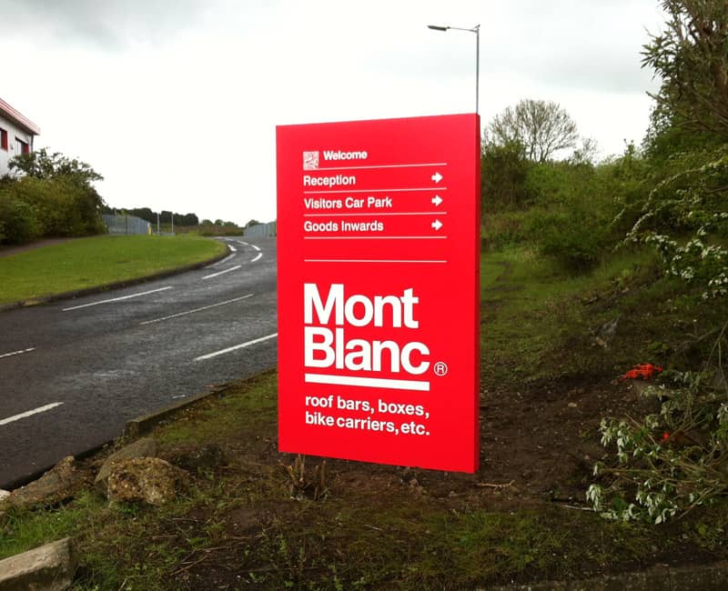
It depends on the type of signage you’re creating. If your signage is for informational purposes, such as directional signs, shop signage, or advertising posters or flyers, its best to include lowercase fonts, as you would for any document.
The main reason to use lowercase fonts in certain situations, is because intuitively, for most people it’s easier to read and absorb in a short space of time, such as when we drive past, or as the station escalator slowly descends or ascends.
Uppercase fonts however, are best used to give instructions or give a warning, such as DANGER, DO NOT ENTER or STOP, as they convey authority, and can be easily understood and absorbed within seconds.
As a note to remember, using uppercase fonts for general advertising is best avoided in most cases, as this type of font can come across as aggressive, and if you’re selling meditation classes for example, you don’t really want to be shouting.
2. Serif or Sans Serif?
First of all, what’s the difference between serif and sans serif font? Although it sounds like the beginning of a terrible joke, most of us don’t think about the differences, and how our choice of serif or sans serif, could actually increase or reduce our signs impact.
What is Serif Font?
Serif font or serif typeface, is named after the little flick, aka the serif at the top and/or the bottom of each letter. Times New Roman is a classic example of a serif font.
What is Sans Serif Font?
Sans serif font is simply a serif font without the serif. The reason it’s called sans serif is because sans means ‘without’ in French. Arial is a typical example of a sans serif font.
Which one is best for signage?
When it comes to choosing between a serif font or a sans serif font, the choice comes down to the clarity you want to achieve. For example, if you use a serif font for a sign, the serifs in letters placed close together can appear more bunched up than a cleaner sans serif font.
Another school of thought, is that serif fonts provide readers with a flow onto the next word, which could also be true, but when designing a sign, especially one that needs to be read quickly, it’s usually best to go for clarity, so choose a clean font, such as Arial, Calibri or Grotesque.
3. The Top 5 Best Fonts for Signage
When deciding on the right font for your signage, there are many things to consider other than whether it’s upper or lowercase, sans serif or serif, including whether it fits with your brand, what image it conveys, and whether it will be legible from a distance.
In the following list, we’ve put together 5 fonts that work well on all types of signage. But, as with most signage design elements, the choice will be dictated by numerous factors including fashion and branding etc., so use the list as a rough guide, but always allow your creativity to flow.
- Helvetica Neue – This sans serif font delivers everything clear signage requires, and will work well on most directional or informational signs.
- Century Gothic – Century Gothic is a relatively new font, and works well on signage headings and is also proven to use less ink than other more popular sans serif fonts.
- Gotham – Similar in style to Century Gothic, Gotham provides that feel of confidence and authority good signage, especially advertising signage needs.
- Poppins – As a very recent addition to the sans serif family of fonts, Poppins provides the crisp clarity all signage needs, whether large or small scale.
- Futura – Created in 1927, Futura works well on both large and small scale signage due to its clean and rounded design.
Sign Maker, Leighton Buzzard
If you’re looking for a professional sign maker in or around Leighton Buzzard, get in touch with Future Signs & Graphics Ltd. today either direct by phone, by email, or via our website contact form.